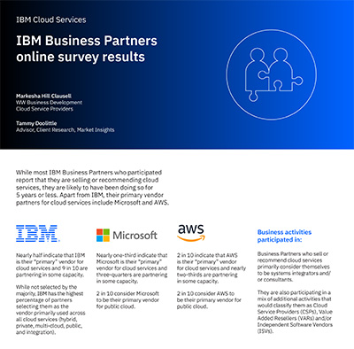
The IBM Business Partners online survey results infographic was designed for my client at IBM Cloud Services. I worked closely with the client team to determine the best way to convey the content through charts, tables, and infographics. This infographic is a good example of how information can be presented in tables and diagrams to make it interesting, enjoyable, and understandable for the end-user. Please click the below image to view the 6 page infographic in its entirety.
