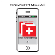
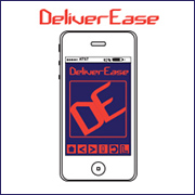
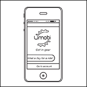
Below are some examples of UX/UI design that include a heuristic evaluation and mockup that was designed for a client, Horizon Blue, which is an affiliate of Blue Cross Blue Shield, a 9 piece portfolio project that details the process from user research to a high-fidelity mockup, and some illustrated mobile application samples that I provided as examples to my students at the time that I began teaching UX/UI design at the International Academy of Design & Technology in Seattle. These projects provide the clients with research and customer interviews, heuristic evaluation, affinity diagrams, customer journey diagrams, user flow diagrams, sketches, low-fidelity mockups, and high-fidelity mockups.
Horizon Blue Heuristic Evaluation
Many UX/UI projects begin with a Heuristic Evaluation of a current website and/or mobile app. Below is an example of a Heuristic Evaluation based on Jakob Nielson’s 10 standard heuristic principles. I designed this Heuristic Evaluation for a potential client while I was the UX Lead and Senior Consultant at Capgemini. There is an embedded link in the presentation that leads to a mockup with several example pages to improve the user flow and user experience from the existing website. Please click the below PDF image to view the Power Point presentation in PDF:
BookIt: Responsive website design
Below is a project that I designed that provides examples of research, a heuristic evaluation and competitive benchmark, an affinity diagram, a customer journey, a user flow diagram, an interaction design sketch, a low-fidelity mockup, and a high-fidelity prototype. This project was designed to build a better user flow and user experience for booking a hotel room.
It began with researching websites and mobile apps that provide users with services for booking hotel rooms. I began with a Competitive Benchmark and Case Study. Please click the icon below to view the PDF version of this document.
The next step in this project was to conduct a one-hour research interview with a potential user. Please click the below icon to view the research conducted with the interview.
The next step in this project was to create an Affinity Diagram. Below are four PDF icons that detail the process of creating a final Affinity Diagram. Please click each icon individually to view the process of creating the final diagram. These were designed in Miro and saved as a PDF.
The following step in this project was to create a simple Flow Diagram that details the basic User Flow of the website. Please click the below icon to view the Flow Diagram.
The next step in this project was to create a Customer Journey Diagram that includes Goals, Behaviors, and Pain Points experienced by the potential user. Please click the below icon to view the Customer Journey.
The next piece to this project is the Flow Diagram. It was designed in Miro and saved as a PDF. The Flow Diagram outlines the user flow that one will experience by using the website to book a hotel room. Please click the below PDF icon to view the Flow Diagram.
The following piece to the project is a hand drawn Interaction Design Sketch which basically outlines the user flow detailed in the Flow Diagram above. It is a hand drawn sketch that shows the drop down menus and user flow as one would navigate the website. Please click the below icon to view the Interaction Design Sketch.
The following PDF is also an Interaction Design Sketch. It is computer generated and basically updates the hand drawn sketch to make the user flow easier to read and understand. It outlines what will happen when the user selects specifics on each page of the website. Please click the below icon to view the computer generated Interaction Design Sketch.
The project is now coming to end and the final pieces are a low-fidelity prototype and a high-fidelity prototype. Please click the below links to view the interactive prototypes. The low-fidelity prototype includes the main buttons will lead to the following page. Click the hotel options to advance to the next page, or you can click the page numbers and arrows at the bottom of the prototype to advance through each component separately.
The high-fidelity prototype includes the branding, color palette, and working links. Thank you for your time and efforts reviewing this project. Sincerely, Jeff
Click here to view the Low-Fidelity Prototype.
Click here to view the High-Fidelity Prototype.
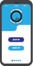
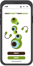
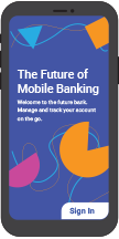
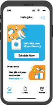
Below are some illustrated mobile application samples that I designed as examples for my students during the time that I was the Design Department Chair and teaching design courses at the International Academy of Design and Technology in Seattle. I used these as examples for a project that I assigned to my students. The scope of the project included researching possible ideas for mobile apps, creating a user flow diagram, and illustrating the application screens. These examples served as illustrative prototypes to demonstrate how to create a mobile application that had the potential to be useful in the real world. Please click each illustration below to find the description and full mobile application layout.
Low fidelity mockups and mood board examples. Please click the images below to view each project.

